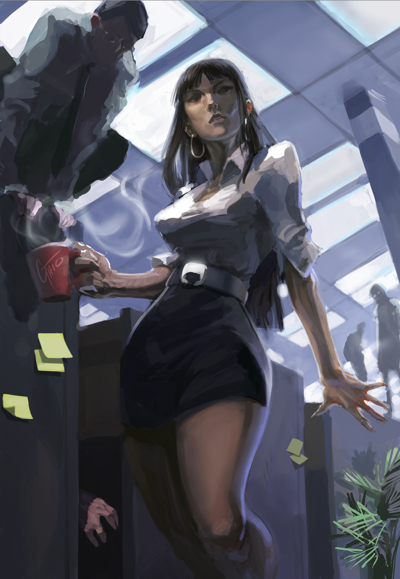
So this is the rough pass of the poster for my short film Apacolatte.... Probably not gonna work on this any longer haha so i should say final pass. Wanted a more comic book-like poster. what do ya guys think of the concept work so far???
I love the lighting and composition and the somewhat omnious overtone with all other workers in the back ground looking down on her. The somewhat exasperated looking expression on her face, it's almost as if she's thinking "what now........"
All in all it looks like a fun piece and you've certainly got me interested about the short film that you mentioned.
I personally don't think there's anyhting else you could do to it, it looks good just the way it is. The only thing I can see that looks a little wonky is the left shouder; it looks a little sharp to me.
First off the piece looks very good! Honestly I agree with you that it is pretty much finished. The only thing that I could suggest is to add some rim lighting on objects and characters on the left side of the piece. This would help define shape and detail in the darker areas and reflect the strong light coming from the right side. Hope that this helps!
I'm also not too sure why but da is making me write minimum of 100 words for a critique but I really wanted to provide you with one so this is my filler text lol
I'll have to check out this film of yours when it comes out. Dude this is one of those types of pictures people fall in love with. Looks great so far. I also noticed Frank Miller mentioned in the comments, careful when checking out that guys stuff, his older work is much better, his new ones..not so much.
Oh, my -- ah!! When I first saw it, I'm just like, "Oh. Chick with coffee, cool." And then... BAM. Well, I'll certainly never work a desk job now. :_D Amazing work though!
I love the lighting and composition and the somewhat omnious overtone with all other workers in the back ground looking down on her. The somewhat exasperated looking expression on her face, it's almost as if she's thinking "what now........"
All in all it looks like a fun piece and you've certainly got me interested about the short film that you mentioned.
I personally don't think there's anyhting else you could do to it, it looks good just the way it is. The only thing I can see that looks a little wonky is the left shouder; it looks a little sharp to me.
great work ^_^
I'm also not too sure why but da is making me write minimum of 100 words for a critique but I really wanted to provide you with one so this is my filler text lol
Take care
The Artist has requested Critique on this Artwork
Please sign up or login to post a critique.